photo courtesy of ping ping
Apple, known for its sleek, modern designs, has failed to impress the city of Georgetown with its architectural plans for their store. Apple’s architectural firm, Bohlin Cywinski Jackson, had plans for “an all-glass front at street level, topped by a slab of masonry with an Apple logo cut through it”.
“The design was too much like a billboard,” said Thomas Luebke, secretary of the commission appointed by the U.S. Commission of Fine Arts. It seems to me that other stores in Georgetown have a pretty modern design (e.g. Puma and Adidas), but the all-glass storefront seems to be the sticking point.
I think it’s great when a neighborhood sticks to consistent design standards to preserve its history and style, especially if it means prolonging the inevitable swarm of UGG-wearing, (sometimes bad) belly-showing, gum-chewing, like-OMGing, Porsche-driving, iPhone-buying* customers.
* Note that the author is one of these people. An iPhone buyer, not a belly shower.
While I’m sympathetic to Georgetown’s sense of aesthetic, I find their objection to the branding sort of ironic considering that M Street is basically a Who’s Who of conspicuous suburban brand name consumption.
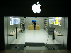
Apple stores have gotten ugly in their latest incarnations. The last time I saw the store at Tyson’s Corner, it was still lovely – natural wood, warm colors, etc. However, the newer store at Fair Oaks Mall is like a garage, complete with cement floor and lots of weathered-looking steel. If that’s the direction Apple is going with their stores now, I can understand Georgetown saying “Nuh-uh.” (Even though, according to the commission, it’s about the giant logo, not the inherent fugliness.)
I’m not opposed to futuristic minimalism, and as a consumer of MANY Apple products I usually appreciate their streamlined aesthetic. But there’s streamlined, and then there’s…a garage.
ha groovymarlin said fugly. love it.
The design they proposed is hideous and laughable, for those who haven’t seen it. I wouldn’t approve it anywhere.
Awesome, now I can get my Apple juice in Georgetown without going to Khakington. Mac has a minimalist style that I agree with, so I can’t complain about the facade.
I like the design very much, but it all depends on the surroundings. If it can fit in with the neighboring buildings without being too visually jarring, I think it’s great. If it’s going to be sandwiched by a pair of colonial-era structures, that’s another story. I expect that is what concerns the commission.
Nothing could be uglier than the all-glass and rusted steel of Urban Outfitters. How’d that facade get past the critics?
Odd since Soho NYC store is within the same old building and although i laugh at the comment about ugg-wearing iphone-buying folks wake up already you’ve just described Georgetown in its existing state quite well.