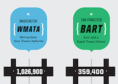
Good has an incredibly sexy graphic comparing WMATA to other large transit systems including CTA, BART, MBTA and MTA, including length of commute averages and other sweet statistics. This is nothing short of sweet, sweet infoporn. How does Metro compare? Right in the middle of the big five transit systems for average commute length, percent active vehicles, ridership and speed.
Like porn, though, I’m not sure if the graphic is representative of reality: how are there really 1M riders on Metrorail + Metrobus on an average day, when an average day has 1.2M trips (not riders) between the two systems and likely a total passenger total of much less than half that number. But hey, we’re probably still ahead of Boston and SF. That counts for something, right?
I live and work in the District of Columbia. I write at We Love DC, a blog I helped start, I work at Technolutionary, a company I helped start, and I’m happy doing both. I enjoy watching baseball, cooking, and gardening. I grow a mean pepper, keep a clean scorebook, and wash the dishes when I’m done. Read Why I Love DC.


whats up with calling the MTA “NYCT” ?
sheesh!
Same reason you call the starlet Trixie in one film and Lacey in another ;)
They do not say there are 1M riders on WMATA each day, they say the ridership is 1M. Ridership = number of trips. No one in the transit industry records ridership by the number of actual people using the system.
Not only are the counting trips rather than individual riders, they’re talking about rail only in the text; but appear to be counting bus and rail in the numbers.
The link you provide gives numbers on a record day – President Obama’s inauguration – with 1.1 million rail trips. The previous day, also a record (for a very brief period), only came in at 866k trips on rail. January 22nd of this year came in at 1.2 million riders, but only if you count the (clearly estimated) 450k bus trips as well. (I chose that date because it is the most recent Monday through Thursday date for which metro provides data on their website).
In any case, the data is a little hinky, but so is yours.