‘Metro_Compared’
courtesy of ‘Don Whiteside’
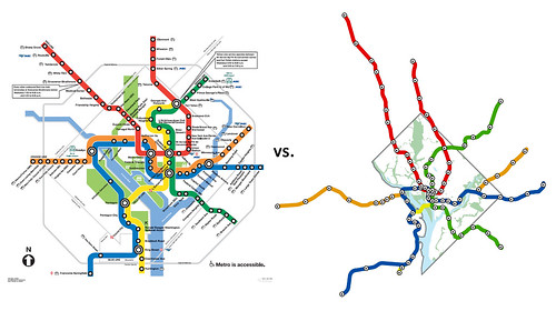
Hi, and welcome to another edition of Mythbusting! After our last feature busted some misconceptions about the busiest Metro stations and lines, we’ll tackle another Metro myth this week: that the Metro map that you see in stations is proportional. The official Metro map shows right angles and evenly-spaced stations throughout the system, and all lines look to be generally the same length. So the real Metro system looks the same when it’s drawn to scale, right?
Definitely not. The Metro system is shown with evenly-spaced stations for clarity, and with evenly-sized lines for formatting reasons, but the actual Metro system looks a lot different when shown to scale. The Red line is much narrower than the official map shows, and that line extends well into Maryland– but Shady Grove and Glenmont are not at the same latitude. Similarly, the Orange and Blue lines extend far west into Virginia, well beyond what the official map shows. The Yellow line is barely visible on the to-scale map. And the length of the lines serving the west and north of the District dwarf the eastern and southern lines.
And as for station spacing, the official map is hugely inaccurate. For example, on the official map, Crystal City, DCA Airport, and Braddock Road appear to be just about equidistant. However, in reality, Crystal City is just about half a mile from the airport, but the Braddock Road stop is another three miles from the airport. The Orange line might be the worst offender: all of the stations from Vienna up to Court House appear to be the same distance apart, but in reality only Ballston, Virginia Square, Clarendon, and Court House are that close together. Those stations are all about a half a mile apart, but East Falls Church, West Falls Church, Dunn Loring, and Vienna stations are all between two and 2.5 miles apart. No wonder that trip out to Vienna seems to stretch on forever!
Finally, showing this Metro map drawn to scale helps answer some of those “Is it faster to…” questions. One that I’ve always wondered about was: if you’re traveling from Fort Totten to Gallery Pl-Chinatown, is it faster to take the Green/Yellow line or the Red line? Well, according to GIS, that section of the Red line is just a tiny bit shorter– 4.95 miles compared to 4.99 miles on the Green/Yellow section. So in reality, just get on the first train that comes, since those sections are almost exactly the same length.
There you have it: the Red line is a weird u-shape, the blue line squiggles like crazy through Virginia, and the Yellow line barely exists. Here are a couple more versions of the map, showing station names. No wonder WMATA has to space out its stations evenly on their map– it’s all but impossible to read otherwise!
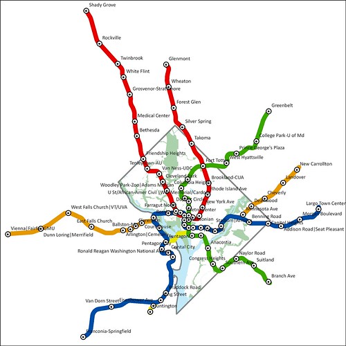
‘Map_Names’
courtesy of ‘Don Whiteside’
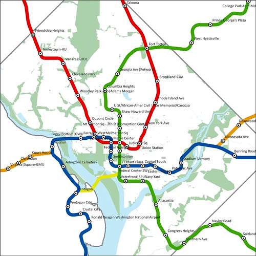
‘Map_DCzoom’
courtesy of ‘Don Whiteside’
*All maps shown with GIS data available from DC’s Data Clearinghouse
Looking at the map to scale is really interesting. When I read this post, though, it felt like you were characterizing the map as being either intentionally misleading just negligent. I don’t believe that to be true at all. Starting with Henry Beck’s 1933 map of the London Underground, we’ve realized that for navigating within a system, what matters most is where you are in relation to where you want to go. The map is schematic. I just wanted to point out that this is most likely completely intentional. Although I did really enjoy seeing the scaled versions. Shady Grove is so far away.
Fascinating! Akin to drawing the human heart as <3 .
@Kate I definitely didn’t mean that I thought the official map was intentionally misleading, and as I mentioned in the second paragraph I totally understand that Metro has to show it that way for clarity and formatting reasons.
I was just surprised at how far apart some of the stations are, and how the north/west suburbs really get the bulk of the suburban service.
without even really knowing it, i’ve been wanting to see something like this for a long, long time!
Awesome! When on the train yesterday, I was thinking about the map. Now I know!
According to the real map the Yellow line doesn’t even have any stops so maybe it really doesn’t exist.
@twoeightnine It’s hidden underneath the blue and green line features on the DC GIS file (which are sorted alphabetically), but there are those two little stops at the end of the line– Huntington and Eisenhower Ave– that are almost on top of each other. So I guess it exists, but just barely.
Yeah but I prefer the idea of a secret, goes nowhere subway like we have in Rochester. http://www.flickr.com/search/?q=rochester%20subway&w=99693955%40N00
At least I now know why I get a good nap in on the way back to my sister’s place near Shady Grove.
The debate about whether to have a geographical correct subway map, is not only limited to DC. In 1972 the famed graphic designer Vignelli, designed a map of the NY subway system, that, like the DC metro map, was non-geographical. Vignelli argued that such maps make it easier to navigate from point A to point B. New Yorkers, however, disagreed and Vignelli’s map was scrapped for the current, geographically correct version. In 2008, Vignelli updated the NY subway map using his original design. The NY Times has a good article on the controversy here http://www.nytimes.com/2006/09/03/nyregion/thecity/03maps.html
Here it is on Google Maps:
http://www.google.com/gadgets/directory?synd=mpl&hl=en&gl=en&url=http://www.cedorman.com-a.googlepages.com/dcmetrorail.xml
The distortion of transport route maps was quite common in the latter part of the 19th Century as the railroads attempted to attract settlers to their land grants.
See: http://memory.loc.gov/ammem/gmdhtml/rrhtml/rrintro.html
under “Land Grants”.
ADC’s scaled version has been around for a long time.
Another problem with the Metro map is that it has no box explaining that some Red Line trains don’t go beyond Silver Spring. It has boxes explaining similar situations at Grosvenor and Fort Totten, but not Silver Spring. Why are they not warning travelers to Forest Glen, Wheaton, and Glenmont that their service may be poor?
Pingback: discojing » Blog Archive » Show ‘n Tell Issue 11