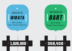
Good has an incredibly sexy graphic comparing WMATA to other large transit systems including CTA, BART, MBTA and MTA, including length of commute averages and other sweet statistics. This is nothing short of sweet, sweet infoporn. How does Metro compare? Right in the middle of the big five transit systems for average commute length, percent active vehicles, ridership and speed.
Like porn, though, I’m not sure if the graphic is representative of reality: how are there really 1M riders on Metrorail + Metrobus on an average day, when an average day has 1.2M trips (not riders) between the two systems and likely a total passenger total of much less than half that number. But hey, we’re probably still ahead of Boston and SF. That counts for something, right?